Unveiling the Stories of Hong Kong’s Public Housing: A New Visual Identity Celebrating Community Warmth
Background
Hong Kong Public Housing is a dedicated platform that explores the essence and narratives of Hong Kong’s public housing estates.
Design Solution
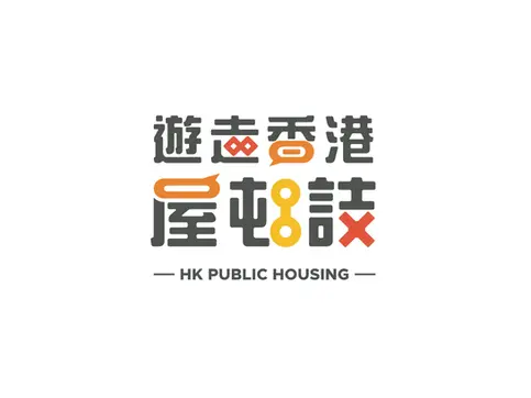
This reimagined visual identity draws inspiration from the city’s iconic public housing typologies — Twin Tower, Harmony Block and Circular Block — capturing the unique character and cultural significance of these communities. The design conveys a deep respect for and celebration of Hong Kong’s public housing heritage.
Typography serves as the cornerstone of the design, harmoniously integrated with elements inspired by the classic housing typologies. This approach ensures the logo is engaging yet retains clarity and readability. The inclusion of dialogue bubbles symbolises the close-knit relationships and human connections within these neighbourhoods, fostering a sense of community and belonging.
The colour palette features vibrant orange-red and yellow hues, evoking the warmth, energy, and friendliness of Hong Kong’s residents. These bold, inviting tones not only capture attention but also resonate with the shared memories and significance of public housing estates, encouraging reflection on their vital role in the city’s fabric.
As a designer who grew up in various public housing estates, I bring a personal connection to this project. Tasked with this meaningful commission, I approached it with enthusiasm and reverence. Beyond the logo, Teatime Design has crafted a series of enamel mugs and canvas bags, each inspired by the distinct characteristics of individual estates. These designs incorporate the unique colour schemes, facilities, and environmental elements of the estates, with the inaugural collection featuring Nam Shan Estate, Shan King Estate, Choi Hung Estate, and Chuk Yuen Estate. The canvas bag designs are equally imbued with the unique charm of public housing estates and local culture. These creations are more than mere objects; they are a heartfelt tribute to the cherished communities they represent.
Through this new visual identity and product series, we aim to inspire greater appreciation and exploration of Hong Kong’s public housing estates, fostering a deeper understanding and value for these vibrant communities. Join us in wandering through Hong Kong to uncover the unique stories of our city!


The colour palette features vibrant orange-red and yellow hues, evoking the warmth, energy, and friendliness of Hong Kong’s residents. These bold, inviting tones not only capture attention but also resonate with the shared memories and significance of public housing estates, encouraging reflection on their vital role in the city’s fabric.


Visual Identity | Illustration | Collaterals
HK Public Housing

